Campaign Best Practices – Tips to avoid being caught by the spam filters

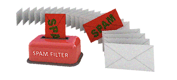
Spam filters consider a list of patterns when analyzing the spamminess of an email. These patterns may include anything from the specific words you use in the subject line and the content of the email body. Depending on the amount of such spam patterns, spam filters will assign a specific score to the email, if the overall spam score goes beyond a certain threshold then the email will be labeled as spam or junk, these words are sometimes pre-fixed to the subject line of the email and go straight to the junk folder of the recipients’ mailbox.

DOs & DON’Ts:

1. Do keep the length of the campaign subject line from 18 until 52 characters

2. Do not use ALL CAPS in the subject line or even within the body of the campaign

3. Avoid using spammy type words and phrases in the subject line and contents such as Free, Cheap, Guaranteed and other similar terms

4. Avoid using too many colored fonts; do not use loud colors in the email body text, such as red or green

5. Do minimize the use of bold text

6. Make sure there are no spelling mistakes or HTML errors; avoid copying directly from MS Word / MS Excel because when you paste content directly from these applications, additional html characters will be automatically added

7. Do not use exclamation sign (“!”) or other punctuation marks more than once

8. Do not use excessive symbols, use descriptive words instead. When you use dollar signs, make sure you do not overdo it ($$$)

9. Do not use overly prominent call-to-action words such as “Click Here” or try obfuscate all of your hyperlinks with where link is http://blog.sendsmith.com and the link text is “Click here”

10. Do keep emails short, too much copy is another red flag for spam filters

11. Do keep your email size under 30kb

12. Do include your physical mailing address and a phone number in the emails

13. Do include a clear unsubscribe link and a physical mailing address in your email footer

14. Do include the date somewhere in the body of your email to show your message is current

List Management

List management is also important, if you are sending to unengaged prospects who are not opening and clicking into most of your campaigns, the mail servers may assume you are a spammy sender. It is because email server providers and ISPs can notice that your campaigns are being ignored by most recipients and assume that you are sending spam.

Email marketers should constantly do the following:-

1. Do ask your subscribers to add your email address to their address books in order to have your campaigns land in their inbox

2. Do ask your subscribers to mark your campaign as not spam if the campaign has landed in their spam folder. If they mark it as spam, then the other public mail servers such as Gmail recipients may also receive it in the spam folder. If they mark it as not spam, your reputation will be raised in the eyes of Gmail.

3. Do encourage your subscribers to reply to your campaign

4. Do not send campaigns to hard bounced or invalid email addresses

5. Do not send several campaigns to the same recipient on the same day

6. Do segment your contacts; send campaigns less often to those subscribers who rarely open your campaigns because low open rates can negatively affect your email delivery

100 Words and Phrases which trigger spam filters that You Should Avoid Using
1. !!! 51. #1
2. $$$ 52. 4U
3. 100% free 53. 50% off
4. Act now! 54. Accept credit cards
5. ALL CAPITALS 55. Additional income
6. All natural 56. Affordable
7. As seen on 57. All new
8. Attention 58. Apply now
9. Bad credit 59. Apply online
10. Bargain 60. Be your own boss
11. Best price 61. Buy direct
12. Billion 62. Call free
13. Certified 63. Cancel at anytime
14. Cost 64. Cash bonus
15. Dear friend 65. Cheap
16. Decision 66. Click here
17. Discount 67. Congratulations
18. Double your income 68. Direct email
19. E.x.t.r.a. Punctuation 69. Direct marketing
20. Eliminate debt 70. Don’t hesitate!
21. Extra income 71. Drastically reduced
22. Fast cash 72. Earn $
23. Fees 73. Full refund
24. Financial freedom 74. Get it now
25. FREE 75. Gift certificate
26. Guarantee 76. Great offer
27. Hot 77. Home based
28. Increase 78. Incredible deal
29. Join millions 79. Information you requested
30. Lose weight 80. Insurance
31. Lowest price 81. Investment
32. Make money fast 82. Limited time offer
33. Marketing 83. Message contains
34. Million dollars 84. No age restrictions
35. Money 85. No experience
36. Money making 86. No gimmicks
37. No medical exams 87. No hidden costs
38. No purchase necessary 88. No questions asked
39. Online pharmacy 89. Offer
40. Opportunity 90. Online degree
41. Partners 91. Online marketing
42. Performance 92. Order Now
43. Rates 93. Passwords
44. Satisfaction guaranteed 94. Please read
45. Search engine listings 95. Risk free
46. Selling 96. Save $
47. Success 97. Serious cash
48. T e x t w i t h g a p s 98. Special promotion
49. Trial 99. Urgent
50. Visit our website 100. Web traffic


Compatibility Considerations for Programming Responsive Email Templates

This article is for coders / developers who have the daunting task of programming responsive email templates. For experienced programmers of responsive email templates,so I am sure many of the email browser idiosyncracies mentioned herein will be familiar to you.

For those who are programming a responsive email template for the first time, the current industry standard for the EDM’s width is 600px; so make sure you use this standard before going further. I’ve discussed this quite thoroughly here:- EDM’s width standard.

First things first, here are list of do’s and do not’s for programming responsive email templates:-

  1. Do not use Javascript anywhere – it would increase your spam score and all instances will be ignored by 99% of email browsers
  2. Do not embed CSS style sheets (e.g. <link rel=”stylesheet” type=”text/css” href=”http://xxxxxxx/xxxx.css”>
  3. Do not even try to put CSS style information in <style type=”text/css”> .class1 { } … </style> in <head> because Gmail will ignore
  4. Do not try to use <div> for organising the display layout in the template and avoid using <div> generally as Outlook doesn’t know how to handle properly
  5. Do use <table> for organising the display layout
  6. Do use max-width:600px within inline style for achieving responsiveness

I will discuss some of the compatibility issues I have encountered with each of the major email browers:-

(1) GMAIL

I have no idea why but Gmail will ignore all style instructions that are written in the header of the HTML.

e.g.

<head>
<style type=”text/css”>
</style>
</head>Will be ignored.

So all style instructions need to be “in-line” e.g.
<td style=”color:#000000;”>Random text</td>

As you can see, this causes immense amount of code duplicity. There are two approaches, write your HTML with the stylesheet at the top and use an in-lining tool right at the end to get all of the code “in-lined” into the HTML and delete the style information at the top before going live. I’ve tried this approach and it doesn’t really work especially when you are trying to version control all your source code and each iteration of change encompasses a lot of extra work. Therefore, the best approach is to avoid using <style> all together from the onset.

(2) Yahoo Mail

They have recently upgraded their email browser interpreter and it is much better now and the mobile version will respond to media queries (e.g. @media). However, because Microsoft Outlook still doesn’t support media queries it is not something we can use yet to bring about responsiveness in emails.

What I discovered with Yahoo Mail is that they do not allow you to embed background image in the <body> tag.

So if you want a full background image for the email template – the only way to do it is to put the background image in a table.

e.g.
<body>
<table width=”100%” background=”http://sxxxxx/background.jpg” style=”background-image: url(‘http://sxxxxx/background.jpg’);”>….
</table>
</body>

(3) Microsoft Outlook

Once upon time, Outlook (and Outlook Express) had 80% of the market share in the email browser sphere; alas, they have dwindled in significance.

Because Outlook doesn’t really understand <div> and style=”inline-block;” – each time we want to achieve the same effect in Outlook. Therefore, we have to write custom Outlook code (usually in tables) to achieve the same effect.

E.g.
<!–[if (gte mso 9)|(IE)]>
 <table width=”100%” cellspacing=”10″>
 <tr>
 <td width=”100%” valign=”top”>
 <![endif]–>
<div class=”column” style=”width: 100%;max-width: 600px;display: inline-block;vertical-align: top;”>
…………………..
</div>
  <!–[if (gte mso 9)|(IE)]>
  </td></tr></table>
   <![endif]–>

So anything that starts with   <!–[if (gte mso 9)|(IE)]> will be interpreted by Outlook and in the above code. Thus, the custom Outlook snippet acts like a wrapper to achieve the same effect on Outlook as what the <div> does on other email browsers.

—-

There are other email browser specific points to look out which I will cover in the next article.

Thanks for reading and stay tuned.


Difference Between Responsive Email Templates and Responsive Website Templates

I hope to explain in the plainest language the difference between responsive email templates and responsive website templates. Thus, even if you are not a coder / developer you will be able to understand the basic concept.

Let us start with the definition of “Responsive”; what this means is that the email template or the website template contains some embedded algorithm. Thus, this will respond to the screen size of the device (on which they are viewed) and display the best-fitting version.

The concept of “Responsive” templates is relatively new and is in answer to the deluge of new viewing devices from smart phones to tablets to mini-tablets, etc. Thus,this has come into popular use recently (in the last 6 years) each with different sizes and viewing dimensions.

Responsive Website Templates

When we view a webpage, we normally do so through a web browser such as Firefox, Chrome, Safari, Internet Explorer, Opera and a few others. Even with the diversity of these different web browsers, there are only 4 major underlying interpreters (e.g. webkit, Trident, Gecko, Blink). For instance, both Opera and Chrome use the Blink technology to interpret webpages. It means if your web page looks fine on the latest version of Chrome. Then it would most likely look fine on the latest version of Opera.

Having 4 separate underlying interpreters has been the cause of headaches for website programmers. This is because the same webpage will display differently on different browsers. Unfortunately, all the browser developers are fighting for dominance rather than collaborating to build a common standard so they are all pulling apart and going their separate ways; as a result; developers are now having to write special instructions within webpages to tell each browser what to do. The special instructions are usually in the form of CSS (Cascading Style Sheet). And there are formatting instructions that are embedded in the webpage.  An example of these instructions are as follows:-

div {
-webkit-transition: width 2s, height 4s; /* Safari */
transition: width 2s, height 4s;
}

In the above snippet, -webkit-transition is a special instruction to Safari browsers only but not to any of the other browsers, so only Safari browsers will take note of the instruction -webkit-transition.

For achieving responsiveness on webpages, we define how the page responds using special instructions embedded in the CSS code called “Media Queries” which look like this:-

@media (max-width: 320px) {
html {
font-size: 60.5%;
}
}
@media (max-width: 480px) {
html {
font-size: 70%;
}
}

“@media” just defines what happens when the device is smaller than 320 pixels in width. By doing so developers can define the page’s formatting given a certain screen dimension through which achieve responsiveness.

The Difference?

So going back to the initial question of the difference between responsive website templates and responsive email templates. Now that we have covered how website templates are programmed to achieve responsiveness we will do the same for email templates. Thus, you will have a overview of the underlying mechanism for both websites and emails.

Responsive Email Templates

Unfortunately, email browsers (or traditionally Mail User Agents – MUA) are even more tricky and diverse than web browsers where some are entirely cloud-based (e.g. Yahoo! mail), some are application-based (e.g. Microsoft Outlook) and some are a hybrid of the two (e.g. Zimbra). In addition, email browsers do not allow the embedding of Javascript code [for security reasons] and CSS3 support is not consistently supported either so we are not able to adopt either of these technologies in the programming of responsive email templates.

So how can we achieve responsiveness on email templates?

Back in 2000 before CSS was very popular the position of elements on webpages were controlled entirely by the creative use of tables within tables [or nested tables]. For the programming of email templates, we have not really moved away from this model. Even to this day, email templates are using nested tables and not CSS. Because Media Queries are a CSS3 directive, they cannot be used in email templates. Therefore, we have to find other ways to make an email template responsive.

Creative developers got around the issue using tables and inline CSS directives to give the illusion of responsiveness?

The following is an example of using HTML code to make 2 columns in an email reflow to display one after the other in a singe column.  Please do not get put off if you can’t understand the code below.

You can see that the by using the directive “max-width” and nested tables. Therefore, we are able to achieve (in a very crude way) responsive display whereby one table is reflowed below the other. However, there are many limitations with the method in the way that it is much harder. If not impossible, to control the order of the reflow and the triggers for reflow.

So in answer to the original question of the difference between responsive website templates and responsive email templates. We can now see that the underlying technologies are about as far apart as they get even though both technologies appear to be doing the same thing. In fact, there are virtually no similarities at all in the programming code for website templates and email templates. Therefore, at least for the next 5 years we will have to continue to develop separate responsive templates for websites and emails.

As a developer, I really hope that life will become simpler and email browsers will converge more. Therefore, we will be able to write a single template that will work on all web browsers and all email browsers; until then developers will continue to have to write separate templates for the web and for emails and test each template across a myriad browsers.

Example of Responsive Email Code:-

<!– Start 2 Columns –>
<table align=”center” style=”width: 100%;max-width: 620px;”>
<tr>
<td style=”padding: 0;text-align: center;font-size: 0;”>
<!–[if (gte mso 9)|(IE)]>
<table width=”100%” cellspacing=”10″>
<tr>
<td width=”50%” valign=”top”>
<![endif]–>
<div class=”column” style=”width: 100%;max-width: 300px;display: inline-block;vertical-align: top;”>
<table style=”border-spacing: 0;width: 100%;font-size: 16px;text-align: left;”>
<tr>
<td align=”left”> Column 1 Text
</td>
</tr>
</table>
</div>
<!–[if (gte mso 9)|(IE)]>
</td><td width=”50%” valign=”top”>
<![endif]–>
<div style=”width: 100%;max-width: 300px;display: inline-block;vertical-align: top;”>
<table style=”border-spacing: 0;width: 100%;font-size: 16px;text-align: left;”>
<tr>
<td align=”left”>
Column 2 Text
</td>
</tr>
</table>
</div>
<!–[if (gte mso 9)|(IE)]>
</td>
</tr>
</table>
<![endif]–>
</td>
</tr>
</table>
</li>
<!– End 2 Columns  –>