This article is for coders / developers who have the daunting task of programming responsive email templates. For experienced programmers of responsive email templates,so I am sure many of the email browser idiosyncracies mentioned herein will be familiar to you.
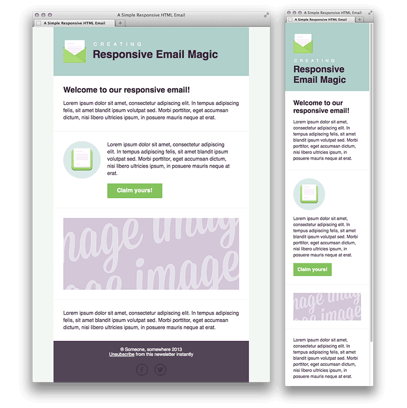
For those who are programming a responsive email template for the first time, the current industry standard for the EDM’s width is 600px; so make sure you use this standard before going further. I’ve discussed this quite thoroughly here:- EDM’s width standard.
First things first, here are list of do’s and do not’s for programming responsive email templates:-
- Do not use Javascript anywhere – it would increase your spam score and all instances will be ignored by 99% of email browsers
- Do not embed CSS style sheets (e.g. <link rel=”stylesheet” type=”text/css” href=”http://xxxxxxx/xxxx.css”>
- Do not even try to put CSS style information in <style type=”text/css”> .class1 { } … </style> in <head> because Gmail will ignore
- Do not try to use <div> for organising the display layout in the template and avoid using <div> generally as Outlook doesn’t know how to handle properly
- Do use <table> for organising the display layout
- Do use max-width:600px within inline style for achieving responsiveness
I will discuss some of the compatibility issues I have encountered with each of the major email browers:-
(1) GMAIL
I have no idea why but Gmail will ignore all style instructions that are written in the header of the HTML.
e.g.
<head>
<style type=”text/css”>
</style>
</head>Will be ignored.
So all style instructions need to be “in-line” e.g.
<td style=”color:#000000;”>Random text</td>
As you can see, this causes immense amount of code duplicity. There are two approaches, write your HTML with the stylesheet at the top and use an in-lining tool right at the end to get all of the code “in-lined” into the HTML and delete the style information at the top before going live. I’ve tried this approach and it doesn’t really work especially when you are trying to version control all your source code and each iteration of change encompasses a lot of extra work. Therefore, the best approach is to avoid using <style> all together from the onset.
(2) Yahoo Mail
They have recently upgraded their email browser interpreter and it is much better now and the mobile version will respond to media queries (e.g. @media). However, because Microsoft Outlook still doesn’t support media queries it is not something we can use yet to bring about responsiveness in emails.
What I discovered with Yahoo Mail is that they do not allow you to embed background image in the <body> tag.
So if you want a full background image for the email template – the only way to do it is to put the background image in a table.
e.g.
<body>
<table width=”100%” background=”http://sxxxxx/background.jpg” style=”background-image: url(‘http://sxxxxx/background.jpg’);”>….
</table>
</body>
(3) Microsoft Outlook
Once upon time, Outlook (and Outlook Express) had 80% of the market share in the email browser sphere; alas, they have dwindled in significance.
Because Outlook doesn’t really understand <div> and style=”inline-block;” – each time we want to achieve the same effect in Outlook. Therefore, we have to write custom Outlook code (usually in tables) to achieve the same effect.
E.g.
<!–[if (gte mso 9)|(IE)]>
<table width=”100%” cellspacing=”10″>
<tr>
<td width=”100%” valign=”top”>
<![endif]–>
<div class=”column” style=”width: 100%;max-width: 600px;display: inline-block;vertical-align: top;”>
…………………..
</div>
<!–[if (gte mso 9)|(IE)]>
</td></tr></table>
<![endif]–>
So anything that starts with <!–[if (gte mso 9)|(IE)]> will be interpreted by Outlook and in the above code. Thus, the custom Outlook snippet acts like a wrapper to achieve the same effect on Outlook as what the <div> does on other email browsers.
—-
There are other email browser specific points to look out which I will cover in the next article.
Thanks for reading and stay tuned.