Font / Typography Choice for HTML Emails (EDM) 2017

Back in 2000 when Outlook Express and Microsoft Outlook captured about 80% of the email browser market share; email marketeers only had 7 fonts to use in HTML emails [i.e. Arial, Times New Roman, Courier, Sans Serif, Verdana, etc.] and this was because Windows XP came only with these 7 default fonts. If you used a more exotic font like Century Gothic in your HTML email that was not available on the user’s computer then the email would not display properly. Instead, a substitute font would be presented in lieu.

Macs, Linux boxes and smartphones have become more popular devices for viewing emails. Thus, although Windows 8, Windows 10 and the latest Windows do come with a wider choice of fonts the default ones on Macs are generally different to those on Windows machines. Even all devices now come with more fonts. Still, there are very few common fonts that we can use across the board.

You might mention that with CSS2 it is possible to link to font files within the HTML which would allow you to use whatever font you chose as long as you had the .woff, .svg, .eot and .ttf files were available so what is the problem? Unfortunately, for security reasons email browsers do not allow you to link to external fonts so although this works on webpages it would not work on HTML emails.

So, what is the workaround?

There isn’t an elegant workaround yet. However, the good news is there are now an increasing number of default fonts that are available on Macs, Windows and smartphones such as:-

  • Georgia
  • Gill Sans
  • Myriad
  • Palatino
  • Geneva
  • Book Antiqua
  • Trebuchet
  • and others

The other bit of good news is that in CSS we can program the HTML email. Therefore, if one particular font is not available then we use a very similar substitute. For example a font like Century Gothic (which is only available on Windows). For Mac, it is equivalent is Apple Gothic we can program the CSS as:-

font-family: Century Gothic, Apple Gothic, CenturyGothic, AppleGothic,sans-serif;

In the above, what happens is that the email browser will try to present Century Gothic first. If its unavailable then Apple Gothic next and so forth until finally  if all of them are unavailable . Thus, the bog standard Sans-Serif will be used. With this system, sometimes marketeers will use a more exotic primary font (even though coverage would only be about 60%) then a conservative secondary font that looks very similar and then a bog standard font like Arial. With this strategy the email marketeer can achieve a campaign whereby 60% of the recipients would see the communication in the desired presentation. Whilst 30% would see in a similar presentation. Lastly, the remaining 10% in a slightly mundane way.


Typical Open Rate for Email Blasts / Email Marketing Initiatives / Direct Mail

Often clients ask me what is the standard “Open Rate” for email blasts so that they can have an idea about their last email campaign did.

(“Open Rate” refers the number of unique recipients who opened the email newsletter divided by the total number of recipients that were sent the email newsletter – This term is often used in Email Marketing to measure the success of a campaign)

Before proceeding, we should make a distinction between “Unique Open Rates” and the “Total Open Rates”; the former refers to the unique number of recipients whom opened the email (so even if a particular recipient opens the same email several times it would still only count as once) whereas the latter refers to the total number of times an email was opened even if the same recipient opens the email a multiple number of times.

For marketing purposes, it is the industry practice to refer to Unique Open Rates rather than Total Open Rates.

There isn’t a gold standard per se that you must hit for your email campaign to be considered a success. However, of course the higher the Unique Open Rates the more successful the campaign is. It is important to note that the (i) email marketing platform you use, (ii) the email communication itself and (iii) the quality of your email list will have an impact on Unique Open Rates.

(i) Email Marketing Platform

Your Email Marketing Platform plays an important role in achieving better Unique Open Rates. Where it should have a function to automatically take out email addresses that have bounced in the past. It ensures that you do not send emails to email accounts that no longer exist. Thus, it would naturally increase the Unique Open Rates.  Most email marketing systems such as SendSmith, Constant Contact, Vertical Response, etc. will do this.

(ii) Email Communication

The Email Communication or EDM (Electronic Direct Mailing) must be professionally-designed and visually-appealing; this first impression will be important as most users will make a decision on whether read more or delete the email based on the first impression. With an increasing number of users viewing emails through mobile devices, it is important for the EDM to be mobile-responsive. Also try to adopt best practices to avoid being caught by spam filter will also increase delivery rates and thus open rates (See article on “Best Practice to Avoid Ending Up in the Spam Box“)

(iii) Quality of Your Email List

The quality of your email list will have a dramatic impact on the Unique Open Rates. This is because if you have a list of highly-engaged recipients then the Unique Open Rates will reflect that. To achieve better Unique Open Rates, ensure that the email marketing platform you use offers automatic bounced email address removal, opt-in /opt-out features and list segmentation. List segmentation refers to your ability to categorise your recipients based on their interests (e.g. I segment my email list into the type of music the recipient has expressed interest in and whether he/she attended one of our shows. Thus, when organising a jazz event I only send to the jazz list). Therefore, when sending out the EDM you should only choose the segments of your email list that the EDM targets.

In conclusion, I think any email campaign should at least aim to achieve above 10% Unique Open Rates. Anything less probably means that one or a combination of the above parameters needs addressing.


Purchasing Email Lists for Email Marketing

Occasionally clients ask me whether I know of any parties who sell email lists. And my answer always is “purchasing email lists is illegal”. Also, I do not want any part of it. Many of the clients ask this innocently thinking that maybe doing some email marketing to a purchased lists could help them generate more new business. However, often they haven’t thought through the ramifications.

Even if you are ever presented with the opportunity to purchase email lists, we would strongly advise you not to do so for these reasons:-

How Many Times the List had been Sold?

The seller of the email list might have sold the same list to many other gullible buyers before trying to sell to you. This means that all of the contacts within the list would have received tons of emails from previous buyers on matters of no interest to them. Therefore, even they receive an email from you they will likely delete it straight away without opening it.

How the seller Acquired the list?

It is almost guaranteed that the means through which the seller acquired the list was illegal or semi-illegal. The seller may have written some scripts that trawled the internet for email addresses. Or hacked somebody’s email accounts and aggregated the contact list to the email list or bought the list from some cyber criminals. So by purchasing this email list you will be condoning criminal activities and risk criminal charges.

Quality of Contacts

The quality of contacts on these purchased lists are always going to be low . In addition, it will be irrelevant to your business. And even if you send an EDM to the list you will likely receive high bounce rates and low open rates.

The Damage to Your Brand

The most important consideration to purchasing email lists is the damage it will do to your brand. When users receive your EDM, they might threaten to take legal action against you. This is because they had not opted-in to your EDMs. Also, even if the recipient does not take legal action they will associate your brand with illegitimate practices.

In conclusion, not only will purchasing email list cost you money. Also, the end result will be irreparable damage to your brand. So, I strongly urge anyone considering purchasing email lists to desist from doing so.


Optimising Open Rates for Electronic Direct Mailing (EDMs)

I am constantly asked by clients about ways to improve open rate when sending out EDMs (Electronic Direct Mailing). In this article I want to talk solely about the timing of sending out email campaigns.

Avoid Weekends

Unless you are sending a reminder Electronic Direct Mailing for a same day event that falls on the weekend then this is not the time for sending out Electronic Direct Mailings. The main reason is that people will likely get it on Monday when they are back in the office. And they will deluged with a pile of emails that they need to weed through. Under such circumstances, the chances of your email getting deleted without being opened will be significantly higher.

Avoid Middle of the Night

Obviously, people are less likely to check emails in the middle of the night and the most likely time they will have a chance to go through their mailboxes will be when they wake up or get to the office. At which time, they would probably have received a lot of unimportant emails which would be systematically deleted.

Best Times

There are a number of times during the day when you can consider sending out Electronic Direct Mailings and they include late morning, lunch time and afternooneven early evening is not a bad time as people want to nod off work but can’t so they are more likely to open your Electronic Direct Mailings.


Campaign Best Practices – Tips to avoid being caught by the spam filters

Spam filters consider a list of patterns when analyzing the spamminess of an email. These patterns may include anything from the specific words you use in the subject line and the content of the email body. Depending on the amount of such spam patterns, spam filters will assign a specific score to the email, if the overall spam score goes beyond a certain threshold then the email will be labeled as spam or junk, these words are sometimes pre-fixed to the subject line of the email and go straight to the junk folder of the recipients’ mailbox.

DOs & DON’Ts:

1. Do keep the length of the campaign subject line from 18 until 52 characters

2. Do not use ALL CAPS in the subject line or even within the body of the campaign

3. Avoid using spammy type words and phrases in the subject line and contents such as Free, Cheap, Guaranteed and other similar terms

4. Avoid using too many colored fonts; do not use loud colors in the email body text, such as red or green

5. Do minimize the use of bold text

6. Make sure there are no spelling mistakes or HTML errors; avoid copying directly from MS Word / MS Excel because when you paste content directly from these applications, additional html characters will be automatically added

7. Do not use exclamation sign (“!”) or other punctuation marks more than once

8. Do not use excessive symbols, use descriptive words instead. When you use dollar signs, make sure you do not overdo it ($$$)

9. Do not use overly prominent call-to-action words such as “Click Here” or try obfuscate all of your hyperlinks with where link is http://blog.sendsmith.com and the link text is “Click here”

10. Do keep emails short, too much copy is another red flag for spam filters

11. Do keep your email size under 30kb

12. Do include your physical mailing address and a phone number in the emails

13. Do include a clear unsubscribe link and a physical mailing address in your email footer

14. Do include the date somewhere in the body of your email to show your message is current

List Management

List management is also important, if you are sending to unengaged prospects who are not opening and clicking into most of your campaigns, the mail servers may assume you are a spammy sender. It is because email server providers and ISPs can notice that your campaigns are being ignored by most recipients and assume that you are sending spam.

Email marketers should constantly do the following:-

1. Do ask your subscribers to add your email address to their address books in order to have your campaigns land in their inbox

2. Do ask your subscribers to mark your campaign as not spam if the campaign has landed in their spam folder. If they mark it as spam, then the other public mail servers such as Gmail recipients may also receive it in the spam folder. If they mark it as not spam, your reputation will be raised in the eyes of Gmail.

3. Do encourage your subscribers to reply to your campaign

4. Do not send campaigns to hard bounced or invalid email addresses

5. Do not send several campaigns to the same recipient on the same day

6. Do segment your contacts; send campaigns less often to those subscribers who rarely open your campaigns because low open rates can negatively affect your email delivery

100 Words and Phrases which trigger spam filters that You Should Avoid Using
1. !!! 51. #1
2. $$$ 52. 4U
3. 100% free 53. 50% off
4. Act now! 54. Accept credit cards
5. ALL CAPITALS 55. Additional income
6. All natural 56. Affordable
7. As seen on 57. All new
8. Attention 58. Apply now
9. Bad credit 59. Apply online
10. Bargain 60. Be your own boss
11. Best price 61. Buy direct
12. Billion 62. Call free
13. Certified 63. Cancel at anytime
14. Cost 64. Cash bonus
15. Dear friend 65. Cheap
16. Decision 66. Click here
17. Discount 67. Congratulations
18. Double your income 68. Direct email
19. E.x.t.r.a. Punctuation 69. Direct marketing
20. Eliminate debt 70. Don’t hesitate!
21. Extra income 71. Drastically reduced
22. Fast cash 72. Earn $
23. Fees 73. Full refund
24. Financial freedom 74. Get it now
25. FREE 75. Gift certificate
26. Guarantee 76. Great offer
27. Hot 77. Home based
28. Increase 78. Incredible deal
29. Join millions 79. Information you requested
30. Lose weight 80. Insurance
31. Lowest price 81. Investment
32. Make money fast 82. Limited time offer
33. Marketing 83. Message contains
34. Million dollars 84. No age restrictions
35. Money 85. No experience
36. Money making 86. No gimmicks
37. No medical exams 87. No hidden costs
38. No purchase necessary 88. No questions asked
39. Online pharmacy 89. Offer
40. Opportunity 90. Online degree
41. Partners 91. Online marketing
42. Performance 92. Order Now
43. Rates 93. Passwords
44. Satisfaction guaranteed 94. Please read
45. Search engine listings 95. Risk free
46. Selling 96. Save $
47. Success 97. Serious cash
48. T e x t w i t h g a p s 98. Special promotion
49. Trial 99. Urgent
50. Visit our website 100. Web traffic


Slideshows in EDMs (Electronic Direct Mailing)

Many from marketing & communications departments asked me whether they could include a slideshow in EDMs. They even go as far as sending me fantastic reference websites with slideshow examples.Javascript

Unfortunately, email browsers will ignore all slideshows on websites use Javascript technology for security reasons; so any effects you see that uses Javascript is not available in emails such as embedding video players, forms, etc.

Animated-GIFs in EDMs

The only possible way to include a pseudo-slideshow effect in an EDM is to use animated-GIFs.  In addition, you can read more about Animated-GIFs here:-

http://mic.com/articles/43615/everything-you-need-to-know-about-gifs-explained-in-gifs#.Km1J5xDpY

However the issue with animated-GIFs is that you can only use a maximum of 256 colours and the images tend to be quite big so it would take a while to download. So we generally do not advise the use of animated-GIFs as a somewhat ugly workaround.

Compatibility Considerations for Programming Responsive Email Templates

This article is for coders / developers who have the daunting task of programming responsive email templates. For experienced programmers of responsive email templates,so I am sure many of the email browser idiosyncracies mentioned herein will be familiar to you.

For those who are programming a responsive email template for the first time, the current industry standard for the EDM’s width is 600px; so make sure you use this standard before going further. I’ve discussed this quite thoroughly here:- EDM’s width standard.

First things first, here are list of do’s and do not’s for programming responsive email templates:-

  1. Do not use Javascript anywhere – it would increase your spam score and all instances will be ignored by 99% of email browsers
  2. Do not embed CSS style sheets (e.g. <link rel=”stylesheet” type=”text/css” href=”http://xxxxxxx/xxxx.css”>
  3. Do not even try to put CSS style information in <style type=”text/css”> .class1 { } … </style> in <head> because Gmail will ignore
  4. Do not try to use <div> for organising the display layout in the template and avoid using <div> generally as Outlook doesn’t know how to handle properly
  5. Do use <table> for organising the display layout
  6. Do use max-width:600px within inline style for achieving responsiveness

I will discuss some of the compatibility issues I have encountered with each of the major email browers:-

(1) GMAIL

I have no idea why but Gmail will ignore all style instructions that are written in the header of the HTML.

e.g.

<head>
<style type=”text/css”>
</style>
</head>Will be ignored.

So all style instructions need to be “in-line” e.g.
<td style=”color:#000000;”>Random text</td>

As you can see, this causes immense amount of code duplicity. There are two approaches, write your HTML with the stylesheet at the top and use an in-lining tool right at the end to get all of the code “in-lined” into the HTML and delete the style information at the top before going live. I’ve tried this approach and it doesn’t really work especially when you are trying to version control all your source code and each iteration of change encompasses a lot of extra work. Therefore, the best approach is to avoid using <style> all together from the onset.

(2) Yahoo Mail

They have recently upgraded their email browser interpreter and it is much better now and the mobile version will respond to media queries (e.g. @media). However, because Microsoft Outlook still doesn’t support media queries it is not something we can use yet to bring about responsiveness in emails.

What I discovered with Yahoo Mail is that they do not allow you to embed background image in the <body> tag.

So if you want a full background image for the email template – the only way to do it is to put the background image in a table.

e.g.
<body>
<table width=”100%” background=”http://sxxxxx/background.jpg” style=”background-image: url(‘http://sxxxxx/background.jpg’);”>….
</table>
</body>

(3) Microsoft Outlook

Once upon time, Outlook (and Outlook Express) had 80% of the market share in the email browser sphere; alas, they have dwindled in significance.

Because Outlook doesn’t really understand <div> and style=”inline-block;” – each time we want to achieve the same effect in Outlook. Therefore, we have to write custom Outlook code (usually in tables) to achieve the same effect.

E.g.
<!–[if (gte mso 9)|(IE)]>
 <table width=”100%” cellspacing=”10″>
 <tr>
 <td width=”100%” valign=”top”>
 <![endif]–>
<div class=”column” style=”width: 100%;max-width: 600px;display: inline-block;vertical-align: top;”>
…………………..
</div>
  <!–[if (gte mso 9)|(IE)]>
  </td></tr></table>
   <![endif]–>

So anything that starts with   <!–[if (gte mso 9)|(IE)]> will be interpreted by Outlook and in the above code. Thus, the custom Outlook snippet acts like a wrapper to achieve the same effect on Outlook as what the <div> does on other email browsers.

—-

There are other email browser specific points to look out which I will cover in the next article.

Thanks for reading and stay tuned.


Difference Between Responsive Email Templates and Responsive Website Templates

I hope to explain in the plainest language the difference between responsive email templates and responsive website templates. Thus, even if you are not a coder / developer you will be able to understand the basic concept.

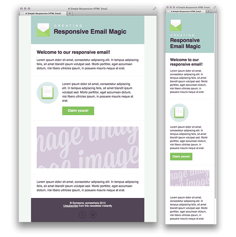
Let us start with the definition of “Responsive”; what this means is that the email template or the website template contains some embedded algorithm. Thus, this will respond to the screen size of the device (on which they are viewed) and display the best-fitting version.

The concept of “Responsive” templates is relatively new and is in answer to the deluge of new viewing devices from smart phones to tablets to mini-tablets, etc. Thus,this has come into popular use recently (in the last 6 years) each with different sizes and viewing dimensions.

Responsive Website Templates

When we view a webpage, we normally do so through a web browser such as Firefox, Chrome, Safari, Internet Explorer, Opera and a few others. Even with the diversity of these different web browsers, there are only 4 major underlying interpreters (e.g. webkit, Trident, Gecko, Blink). For instance, both Opera and Chrome use the Blink technology to interpret webpages. It means if your web page looks fine on the latest version of Chrome. Then it would most likely look fine on the latest version of Opera.

Having 4 separate underlying interpreters has been the cause of headaches for website programmers. This is because the same webpage will display differently on different browsers. Unfortunately, all the browser developers are fighting for dominance rather than collaborating to build a common standard so they are all pulling apart and going their separate ways; as a result; developers are now having to write special instructions within webpages to tell each browser what to do. The special instructions are usually in the form of CSS (Cascading Style Sheet). And there are formatting instructions that are embedded in the webpage.  An example of these instructions are as follows:-

div {
-webkit-transition: width 2s, height 4s; /* Safari */
transition: width 2s, height 4s;
}

In the above snippet, -webkit-transition is a special instruction to Safari browsers only but not to any of the other browsers, so only Safari browsers will take note of the instruction -webkit-transition.

For achieving responsiveness on webpages, we define how the page responds using special instructions embedded in the CSS code called “Media Queries” which look like this:-

@media (max-width: 320px) {
html {
font-size: 60.5%;
}
}
@media (max-width: 480px) {
html {
font-size: 70%;
}
}

“@media” just defines what happens when the device is smaller than 320 pixels in width. By doing so developers can define the page’s formatting given a certain screen dimension through which achieve responsiveness.

The Difference?

So going back to the initial question of the difference between responsive website templates and responsive email templates. Now that we have covered how website templates are programmed to achieve responsiveness we will do the same for email templates. Thus, you will have a overview of the underlying mechanism for both websites and emails.

Responsive Email Templates

Unfortunately, email browsers (or traditionally Mail User Agents – MUA) are even more tricky and diverse than web browsers where some are entirely cloud-based (e.g. Yahoo! mail), some are application-based (e.g. Microsoft Outlook) and some are a hybrid of the two (e.g. Zimbra). In addition, email browsers do not allow the embedding of Javascript code [for security reasons] and CSS3 support is not consistently supported either so we are not able to adopt either of these technologies in the programming of responsive email templates.

So how can we achieve responsiveness on email templates?

Back in 2000 before CSS was very popular the position of elements on webpages were controlled entirely by the creative use of tables within tables [or nested tables]. For the programming of email templates, we have not really moved away from this model. Even to this day, email templates are using nested tables and not CSS. Because Media Queries are a CSS3 directive, they cannot be used in email templates. Therefore, we have to find other ways to make an email template responsive.

Creative developers got around the issue using tables and inline CSS directives to give the illusion of responsiveness?

The following is an example of using HTML code to make 2 columns in an email reflow to display one after the other in a singe column.  Please do not get put off if you can’t understand the code below.

You can see that the by using the directive “max-width” and nested tables. Therefore, we are able to achieve (in a very crude way) responsive display whereby one table is reflowed below the other. However, there are many limitations with the method in the way that it is much harder. If not impossible, to control the order of the reflow and the triggers for reflow.

So in answer to the original question of the difference between responsive website templates and responsive email templates. We can now see that the underlying technologies are about as far apart as they get even though both technologies appear to be doing the same thing. In fact, there are virtually no similarities at all in the programming code for website templates and email templates. Therefore, at least for the next 5 years we will have to continue to develop separate responsive templates for websites and emails.

As a developer, I really hope that life will become simpler and email browsers will converge more. Therefore, we will be able to write a single template that will work on all web browsers and all email browsers; until then developers will continue to have to write separate templates for the web and for emails and test each template across a myriad browsers.

Example of Responsive Email Code:-

<!– Start 2 Columns –>
<table align=”center” style=”width: 100%;max-width: 620px;”>
<tr>
<td style=”padding: 0;text-align: center;font-size: 0;”>
<!–[if (gte mso 9)|(IE)]>
<table width=”100%” cellspacing=”10″>
<tr>
<td width=”50%” valign=”top”>
<![endif]–>
<div class=”column” style=”width: 100%;max-width: 300px;display: inline-block;vertical-align: top;”>
<table style=”border-spacing: 0;width: 100%;font-size: 16px;text-align: left;”>
<tr>
<td align=”left”> Column 1 Text
</td>
</tr>
</table>
</div>
<!–[if (gte mso 9)|(IE)]>
</td><td width=”50%” valign=”top”>
<![endif]–>
<div style=”width: 100%;max-width: 300px;display: inline-block;vertical-align: top;”>
<table style=”border-spacing: 0;width: 100%;font-size: 16px;text-align: left;”>
<tr>
<td align=”left”>
Column 2 Text
</td>
</tr>
</table>
</div>
<!–[if (gte mso 9)|(IE)]>
</td>
</tr>
</table>
<![endif]–>
</td>
</tr>
</table>
</li>
<!– End 2 Columns  –>


Standard Email Width in 2017

Marketing Departments, Developers and general Digital Media folks are constantly at odds with what the industry standard should be for an EDM’s dimensions such as email width (Email Direct Mailing). Also, I hope to throw in my two cents as to how things used to be, what they are currently and where they will likely go.

Before we start, this blog is more targeted towards developers, programmers and marketeers who are familiar with the practice for email marketing and have most likely sent out EDMs in the past. For those haven’t, I will try to avoid using too many technical terms and keep the language as simple as possible.

The dimensions of an EDM have always, historically, been governed by the screen size(s) of the prevailing device(s) displaying them and 10 years ago the screen sizes were considerably more homogeneous than they are today. When I first cut my teeth in email marketing 16 years ago, things were quite different, most people were still using CRT monitors and LCD monitors were just coming out (and much-coveted), back then, the around 50% of the users had a screen resolution of 800 x 600 and around 38% 1024 x 768 and the remaining 12% were something else. And close to 80% of the users viewed emails with Microsoft Outlook or Outlook Express.

For those who are familiar with Microsoft Outlook or Outlook Express, you will know that the default display profile is some folders on the left-hand column and the main email display body area on the right, see below:-

Outlook Express Screenshot
Outlook Express Display

So on a 800 x 600 screen, the main email display body was around 600 pixels so for a while the industry standard for an EDM’s width was 600pixels wide. This is because the single biggest annoyance we tried to avoid submitting our readers to do was scroll right to view the entire EDM. However, this was considered an absolute no no; so even though there were many users 1024 x 768 screens, the industry decided that it would be more acceptable for users with larger screens to see space on either side of the EDM than for users with smaller screens to have to scroll left and right to view the EDM in its entirety.

As such, the 600pixel width stayed as the standard until LCD screens became commonplace around 2005/2006 because the minimum resolution for LCD screens was 1024 x 768.

Several noteworthy points:-

  • Viewing emails with mobile devices was virtually unheard of
  • Scrolling vertically (i.e. up and down) was considered acceptable because most email threads were long and many of the computer mouses had a vertical scroll widget on them so the industry was never as regimented in setting a height standard for EDMs as we were for width
  • With the advent and prevalence of LCD screens, we started to advise clients to use 800 pixels in width for EDMs and this was around 2006. This standard was further strengthened by the release of the first generation iPad in 2009 which had a screen resolution of 1024×768.

And then things changed….

The advent of smartphones turned the world upside down for marketeers and developers alike in the email marketing space making the screen size of the viewing device very heterogeneous. With the release of the first iPhone in 2009, we have witnessed an increase year-on-year in the proportion of users viewing emails on the mobile devices over other devices such as desktops and tablets. In December 2015, the number of users viewing one of our EDMs was 68% on mobile devices compared with 29% on desktop and 3% on tablets (this is in Hong Kong). Therefore, mobile devices has become more and more important and as of today it is no longer a force that can ignored.

Dilemma

The dilemma that we faced was that mobile devices have a much smaller screen compared with desktop computers. Also, we were to cater to just mobile devices then all of our EDMs would have to be 300 pixels in width or less which would look ridiculous on desktops whilst if we displayed the EDMs at 800 pixels to cater for desktop users those viewing with mobile devices would have to constantly zoom in and out to view the communication properly.

By the way, the reason why the the mobiles phones width had to be 300 pixels was because the screen’s width was 320 pixels (iPhone 4) and we allowed for 10pixels padding on either side, see below:-

iphone 4 width
iphone 4 width

So, how could please everybody?

The Advent of Responsive Email Templates

Implementing responsive Email Templates was the answer to the dilemma we faced – “responsiveness” just means that the template’s embedded code will respond to the size of the screen. Also it presents the display differently according to the size of the screen detected.

Much of the time within email templates, there are many different parts or components; for example you may have a header followed by a part with 3 photos displayed in tandem followed by 2 columns of text below. Please see below example:-

Responsive Email Template Example

The above is a screenshot of an email template displayed on a desktop. Together with the same email template would appear like the following on a mobile device:-

responsive email on iPhone
responsive email on iPhone – 3 columns
2 column display on iphone

As one can see the 2 columns on the desktop “reflow” to become 1 column on the iPhone and on both desktop and mobile the images are clear and the words are legible. Bingo! Both worlds are happy.

So to go back to the initial question of what the current industry standard for an EDM’s width is, the current standard is 600 pixels in width. One may argue that it is a regression for Desktop computers whose screens have become larger and larger over the years but yet the EDM’s width has regressed from 800 pixels back to 600 pixels. Admittedly, it is a regression for desktop computers but 600 pixels was a compromise made to satisfy both worlds.

Reason for the Compromise

If an EDM’s width is 800 pixels, then with the 2 column scenario each column would be 400 pixels in width (800 / 2 = 400), however when these columns reflow they would still be too wide for the mobile phones which are only 320 pixels in width so the user would need to scroll left and right to see the entire column. Whereas when the EDM’s width is 600 pixels and each column is 300 pixels, the single column would still appear nicely on mobile devices.

So this is why 600 pixels wide is the current industry standard as of start of 2016.

My Expectations for the Future

With the advent of iPhone 6+ and the Samsung Galaxy S6, the screens are getting wider which can both display 400 pixel width without left-right scrolling. It is quite likely that the industry standard would go back to 800 pixels in the next couple of years as these devices become more commonplace.

Footnote

There are some hard-core technical information that I have left out and other considerations such as email browser compatibility and the difference between responsive email templates and responsive website templates. Therefore, I hope to cover these in more details in other articles.