Back in 2000 when Outlook Express and Microsoft Outlook captured about 80% of the email browser market share; email marketeers only had 7 fonts to use in HTML emails [i.e. Arial, Times New Roman, Courier, Sans Serif, Verdana, etc.] and this was because Windows XP came only with these 7 default fonts. If you used a more exotic font like Century Gothic in your HTML email that was not available on the user’s computer then the email would not display properly. Instead, a substitute font would be presented in lieu.
Macs, Linux boxes and smartphones have become more popular devices for viewing emails. Thus, although Windows 8, Windows 10 and the latest Windows do come with a wider choice of fonts the default ones on Macs are generally different to those on Windows machines. Even all devices now come with more fonts. Still, there are very few common fonts that we can use across the board.
You might mention that with CSS2 it is possible to link to font files within the HTML which would allow you to use whatever font you chose as long as you had the .woff, .svg, .eot and .ttf files were available so what is the problem? Unfortunately, for security reasons email browsers do not allow you to link to external fonts so although this works on webpages it would not work on HTML emails.
So, what is the workaround?
There isn’t an elegant workaround yet. However, the good news is there are now an increasing number of default fonts that are available on Macs, Windows and smartphones such as:-
Georgia
Gill Sans
Myriad
Palatino
Geneva
Book Antiqua
Trebuchet
and others
The other bit of good news is that in CSS we can program the HTML email. Therefore, if one particular font is not available then we use a very similar substitute. For example a font like Century Gothic (which is only available on Windows). For Mac, it is equivalent is Apple Gothic we can program the CSS as:-
font-family: Century Gothic, Apple Gothic, CenturyGothic, AppleGothic,sans-serif;
In the above, what happens is that the email browser will try to present Century Gothic first. If its unavailable then Apple Gothic next and so forth until finally if all of them are unavailable . Thus, the bog standard Sans-Serif will be used. With this system, sometimes marketeers will use a more exotic primary font (even though coverage would only be about 60%) then a conservative secondary font that looks very similar and then a bog standard font like Arial. With this strategy the email marketeer can achieve a campaign whereby 60% of the recipients would see the communication in the desired presentation. Whilst 30% would see in a similar presentation. Lastly, the remaining 10% in a slightly mundane way.
Often clients ask me what is the standard “Open Rate” for email blasts so that they can have an idea about their last email campaign did.
(“Open Rate” refers the number of unique recipients who opened the email newsletter divided by the total number of recipients that were sent the email newsletter – This term is often used in Email Marketing to measure the success of a campaign)
Before proceeding, we should make a distinction between “Unique Open Rates” and the “Total Open Rates”; the former refers to the unique number of recipients whom opened the email (so even if a particular recipient opens the same email several times it would still only count as once) whereas the latter refers to the total number of times an email was opened even if the same recipient opens the email a multiple number of times.
For marketing purposes, it is the industry practice to refer to Unique Open Rates rather than Total Open Rates.
There isn’t a gold standard per se that you must hit for your email campaign to be considered a success. However, of course the higher the Unique Open Rates the more successful the campaign is. It is important to note that the (i) email marketing platform you use, (ii) the email communication itself and (iii) the quality of your email list will have an impact on Unique Open Rates.
(i) Email Marketing Platform
Your Email Marketing Platform plays an important role in achieving better Unique Open Rates. Where it should have a function to automatically take out email addresses that have bounced in the past. It ensures that you do not send emails to email accounts that no longer exist. Thus, it would naturally increase the Unique Open Rates. Most email marketing systems such as SendSmith, Constant Contact, Vertical Response, etc. will do this.
(ii) Email Communication
The Email Communication or EDM (Electronic Direct Mailing) must be professionally-designed and visually-appealing; this first impression will be important as most users will make a decision on whether read more or delete the email based on the first impression. With an increasing number of users viewing emails through mobile devices, it is important for the EDM to be mobile-responsive. Also try to adopt best practices to avoid being caught by spam filter will also increase delivery rates and thus open rates (See article on “Best Practice to Avoid Ending Up in the Spam Box“)
(iii) Quality of Your Email List
The quality of your email list will have a dramatic impact on the Unique Open Rates. This is because if you have a list of highly-engaged recipients then the Unique Open Rates will reflect that. To achieve better Unique Open Rates, ensure that the email marketing platform you use offers automatic bounced email address removal, opt-in /opt-out features and list segmentation. List segmentation refers to your ability to categorise your recipients based on their interests (e.g. I segment my email list into the type of music the recipient has expressed interest in and whether he/she attended one of our shows. Thus, when organising a jazz event I only send to the jazz list). Therefore, when sending out the EDM you should only choose the segments of your email list that the EDM targets.
In conclusion, I think any email campaign should at least aim to achieve above 10% Unique Open Rates. Anything less probably means that one or a combination of the above parameters needs addressing.
Many from marketing & communications departments asked me whether they could include a slideshow in EDMs. They even go as far as sending me fantastic reference websites with slideshow examples.Javascript
Unfortunately, email browsers will ignore all slideshows on websites use Javascript technology for security reasons; so any effects you see that uses Javascript is not available in emails such as embedding video players, forms, etc.
Animated-GIFs in EDMs
The only possible way to include a pseudo-slideshow effect in an EDM is to use animated-GIFs. In addition, you can read more about Animated-GIFs here:-
However the issue with animated-GIFs is that you can only use a maximum of 256 colours and the images tend to be quite big so it would take a while to download. So we generally do not advise the use of animated-GIFs as a somewhat ugly workaround.
Marketing Departments, Developers and general Digital Media folks are constantly at odds with what the industry standard should be for an EDM’s dimensions such as email width (Email Direct Mailing). Also, I hope to throw in my two cents as to how things used to be, what they are currently and where they will likely go.
Before we start, this blog is more targeted towards developers, programmers and marketeers who are familiar with the practice for email marketing and have most likely sent out EDMs in the past. For those haven’t, I will try to avoid using too many technical terms and keep the language as simple as possible.
The dimensions of an EDM have always, historically, been governed by the screen size(s) of the prevailing device(s) displaying them and 10 years ago the screen sizes were considerably more homogeneous than they are today. When I first cut my teeth in email marketing 16 years ago, things were quite different, most people were still using CRT monitors and LCD monitors were just coming out (and much-coveted), back then, the around 50% of the users had a screen resolution of 800 x 600 and around 38% 1024 x 768 and the remaining 12% were something else. And close to 80% of the users viewed emails with Microsoft Outlook or Outlook Express.
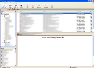
For those who are familiar with Microsoft Outlook or Outlook Express, you will know that the default display profile is some folders on the left-hand column and the main email display body area on the right, see below:-
Outlook Express Display
So on a 800 x 600 screen, the main email display body was around 600 pixels so for a while the industry standard for an EDM’s width was 600pixels wide. This is because the single biggest annoyance we tried to avoid submitting our readers to do was scroll right to view the entire EDM. However, this was considered an absolute no no; so even though there were many users 1024 x 768 screens, the industry decided that it would be more acceptable for users with larger screens to see space on either side of the EDM than for users with smaller screens to have to scroll left and right to view the EDM in its entirety.
As such, the 600pixel width stayed as the standard until LCD screens became commonplace around 2005/2006 because the minimum resolution for LCD screens was 1024 x 768.
Several noteworthy points:-
Viewing emails with mobile devices was virtually unheard of
Scrolling vertically (i.e. up and down) was considered acceptable because most email threads were long and many of the computer mouses had a vertical scroll widget on them so the industry was never as regimented in setting a height standard for EDMs as we were for width
With the advent and prevalence of LCD screens, we started to advise clients to use 800 pixels in width for EDMs and this was around 2006. This standard was further strengthened by the release of the first generation iPad in 2009 which had a screen resolution of 1024×768.
And then things changed….
The advent of smartphones turned the world upside down for marketeers and developers alike in the email marketing space making the screen size of the viewing device very heterogeneous. With the release of the first iPhone in 2009, we have witnessed an increase year-on-year in the proportion of users viewing emails on the mobile devices over other devices such as desktops and tablets. In December 2015, the number of users viewing one of our EDMs was 68% on mobile devices compared with 29% on desktop and 3% on tablets (this is in Hong Kong). Therefore, mobile devices has become more and more important and as of today it is no longer a force that can ignored.
Dilemma
The dilemma that we faced was that mobile devices have a much smaller screen compared with desktop computers. Also, we were to cater to just mobile devices then all of our EDMs would have to be 300 pixels in width or less which would look ridiculous on desktops whilst if we displayed the EDMs at 800 pixels to cater for desktop users those viewing with mobile devices would have to constantly zoom in and out to view the communication properly.
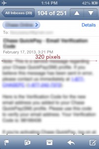
By the way, the reason why the the mobiles phones width had to be 300 pixels was because the screen’s width was 320 pixels (iPhone 4) and we allowed for 10pixels padding on either side, see below:-
iphone 4 width
So, how could please everybody?
The Advent of Responsive Email Templates
Implementing responsive Email Templates was the answer to the dilemma we faced – “responsiveness” just means that the template’s embedded code will respond to the size of the screen. Also it presents the display differently according to the size of the screen detected.
Much of the time within email templates, there are many different parts or components; for example you may have a header followed by a part with 3 photos displayed in tandem followed by 2 columns of text below. Please see below example:-
Responsive Email Template Example
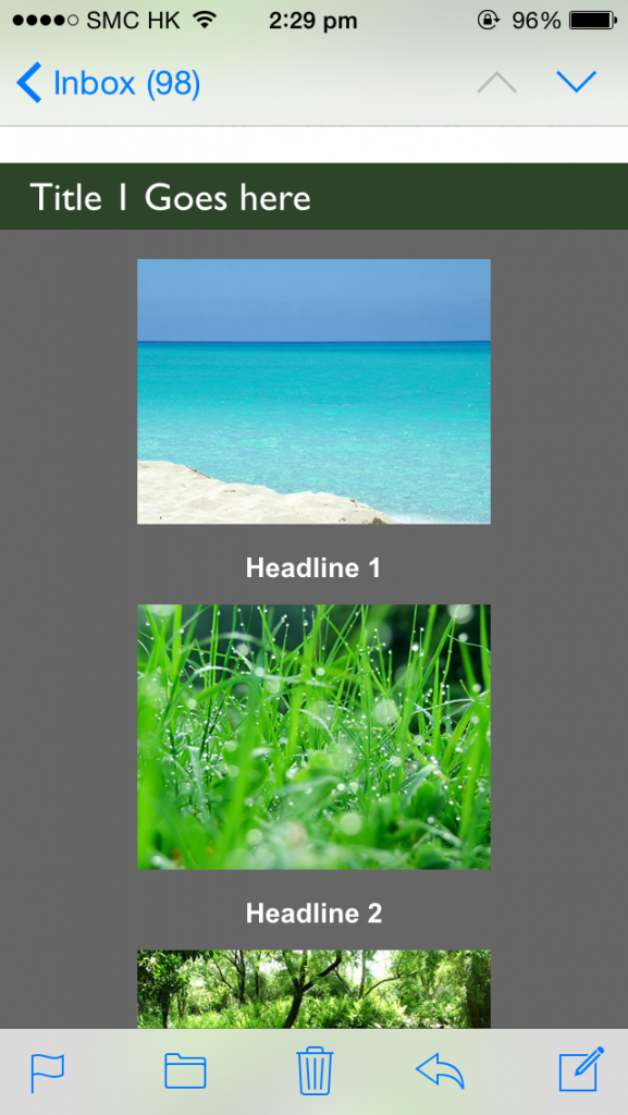
The above is a screenshot of an email template displayed on a desktop. Together with the same email template would appear like the following on a mobile device:-
responsive email on iPhone – 3 columns2 column display on iphone
As one can see the 2 columns on the desktop “reflow” to become 1 column on the iPhone and on both desktop and mobile the images are clear and the words are legible. Bingo! Both worlds are happy.
So to go back to the initial question of what the current industry standard for an EDM’s width is, the current standard is 600 pixels in width. One may argue that it is a regression for Desktop computers whose screens have become larger and larger over the years but yet the EDM’s width has regressed from 800 pixels back to 600 pixels. Admittedly, it is a regression for desktop computers but 600 pixels was a compromise made to satisfy both worlds.
Reason for the Compromise
If an EDM’s width is 800 pixels, then with the 2 column scenario each column would be 400 pixels in width (800 / 2 = 400), however when these columns reflow they would still be too wide for the mobile phones which are only 320 pixels in width so the user would need to scroll left and right to see the entire column. Whereas when the EDM’s width is 600 pixels and each column is 300 pixels, the single column would still appear nicely on mobile devices.
So this is why 600 pixels wide is the current industry standard as of start of 2016.
My Expectations for the Future
With the advent of iPhone 6+ and the Samsung Galaxy S6, the screens are getting wider which can both display 400 pixel width without left-right scrolling. It is quite likely that the industry standard would go back to 800 pixels in the next couple of years as these devices become more commonplace.
Footnote
There are some hard-core technical information that I have left out and other considerations such as email browser compatibility and the difference between responsive email templates and responsive website templates. Therefore, I hope to cover these in more details in other articles.