
Marketing Departments, Developers and general Digital Media folks are constantly at odds with what the industry standard should be for an EDM’s dimensions such as email width (Email Direct Mailing). Also, I hope to throw in my two cents as to how things used to be, what they are currently and where they will likely go.
Before we start, this blog is more targeted towards developers, programmers and marketeers who are familiar with the practice for email marketing and have most likely sent out EDMs in the past. For those haven’t, I will try to avoid using too many technical terms and keep the language as simple as possible.
The dimensions of an EDM have always, historically, been governed by the screen size(s) of the prevailing device(s) displaying them and 10 years ago the screen sizes were considerably more homogeneous than they are today. When I first cut my teeth in email marketing 16 years ago, things were quite different, most people were still using CRT monitors and LCD monitors were just coming out (and much-coveted), back then, the around 50% of the users had a screen resolution of 800 x 600 and around 38% 1024 x 768 and the remaining 12% were something else. And close to 80% of the users viewed emails with Microsoft Outlook or Outlook Express.
For those who are familiar with Microsoft Outlook or Outlook Express, you will know that the default display profile is some folders on the left-hand column and the main email display body area on the right, see below:-
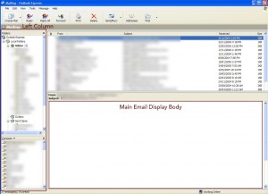
So on a 800 x 600 screen, the main email display body was around 600 pixels so for a while the industry standard for an EDM’s width was 600pixels wide. This is because the single biggest annoyance we tried to avoid submitting our readers to do was scroll right to view the entire EDM. However, this was considered an absolute no no; so even though there were many users 1024 x 768 screens, the industry decided that it would be more acceptable for users with larger screens to see space on either side of the EDM than for users with smaller screens to have to scroll left and right to view the EDM in its entirety.
As such, the 600pixel width stayed as the standard until LCD screens became commonplace around 2005/2006 because the minimum resolution for LCD screens was 1024 x 768.
Several noteworthy points:-
- Viewing emails with mobile devices was virtually unheard of
- Scrolling vertically (i.e. up and down) was considered acceptable because most email threads were long and many of the computer mouses had a vertical scroll widget on them so the industry was never as regimented in setting a height standard for EDMs as we were for width
- With the advent and prevalence of LCD screens, we started to advise clients to use 800 pixels in width for EDMs and this was around 2006. This standard was further strengthened by the release of the first generation iPad in 2009 which had a screen resolution of 1024×768.
And then things changed….
The advent of smartphones turned the world upside down for marketeers and developers alike in the email marketing space making the screen size of the viewing device very heterogeneous. With the release of the first iPhone in 2009, we have witnessed an increase year-on-year in the proportion of users viewing emails on the mobile devices over other devices such as desktops and tablets. In December 2015, the number of users viewing one of our EDMs was 68% on mobile devices compared with 29% on desktop and 3% on tablets (this is in Hong Kong). Therefore, mobile devices has become more and more important and as of today it is no longer a force that can ignored.
Dilemma
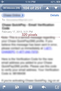
The dilemma that we faced was that mobile devices have a much smaller screen compared with desktop computers. Also, we were to cater to just mobile devices then all of our EDMs would have to be 300 pixels in width or less which would look ridiculous on desktops whilst if we displayed the EDMs at 800 pixels to cater for desktop users those viewing with mobile devices would have to constantly zoom in and out to view the communication properly.
By the way, the reason why the the mobiles phones width had to be 300 pixels was because the screen’s width was 320 pixels (iPhone 4) and we allowed for 10pixels padding on either side, see below:-
So, how could please everybody?
The Advent of Responsive Email Templates
Implementing responsive Email Templates was the answer to the dilemma we faced – “responsiveness” just means that the template’s embedded code will respond to the size of the screen. Also it presents the display differently according to the size of the screen detected.
Much of the time within email templates, there are many different parts or components; for example you may have a header followed by a part with 3 photos displayed in tandem followed by 2 columns of text below. Please see below example:-

The above is a screenshot of an email template displayed on a desktop. Together with the same email template would appear like the following on a mobile device:-
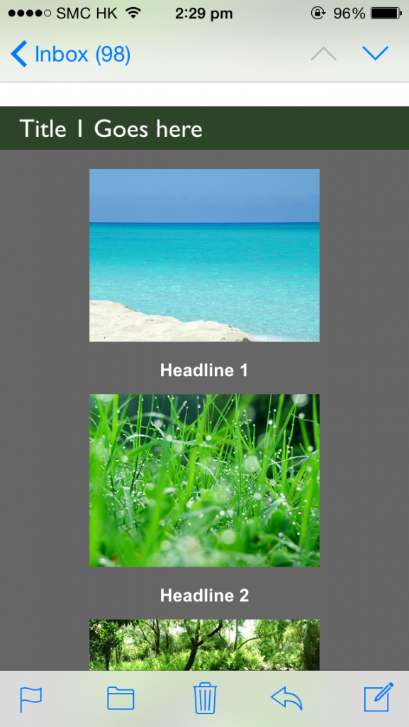
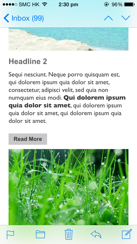
As one can see the 2 columns on the desktop “reflow” to become 1 column on the iPhone and on both desktop and mobile the images are clear and the words are legible. Bingo! Both worlds are happy.
So to go back to the initial question of what the current industry standard for an EDM’s width is, the current standard is 600 pixels in width. One may argue that it is a regression for Desktop computers whose screens have become larger and larger over the years but yet the EDM’s width has regressed from 800 pixels back to 600 pixels. Admittedly, it is a regression for desktop computers but 600 pixels was a compromise made to satisfy both worlds.
Reason for the Compromise
If an EDM’s width is 800 pixels, then with the 2 column scenario each column would be 400 pixels in width (800 / 2 = 400), however when these columns reflow they would still be too wide for the mobile phones which are only 320 pixels in width so the user would need to scroll left and right to see the entire column. Whereas when the EDM’s width is 600 pixels and each column is 300 pixels, the single column would still appear nicely on mobile devices.
So this is why 600 pixels wide is the current industry standard as of start of 2016.
My Expectations for the Future
With the advent of iPhone 6+ and the Samsung Galaxy S6, the screens are getting wider which can both display 400 pixel width without left-right scrolling. It is quite likely that the industry standard would go back to 800 pixels in the next couple of years as these devices become more commonplace.
Footnote
There are some hard-core technical information that I have left out and other considerations such as email browser compatibility and the difference between responsive email templates and responsive website templates. Therefore, I hope to cover these in more details in other articles.