I hope to explain in the plainest language the difference between responsive email templates and responsive website templates. Thus, even if you are not a coder / developer you will be able to understand the basic concept.
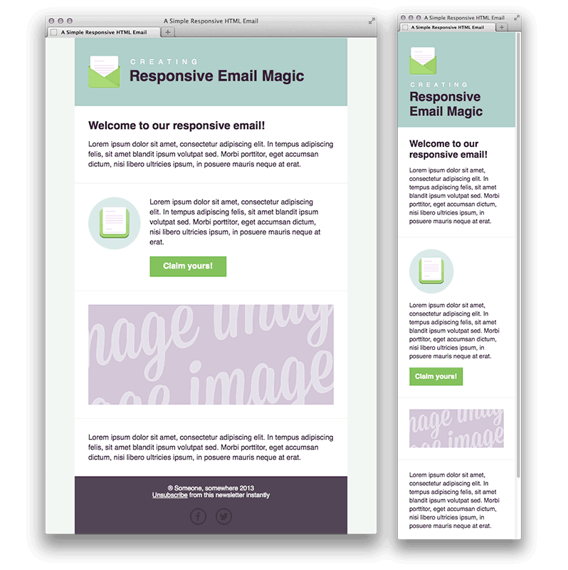
Let us start with the definition of “Responsive”; what this means is that the email template or the website template contains some embedded algorithm. Thus, this will respond to the screen size of the device (on which they are viewed) and display the best-fitting version.
The concept of “Responsive” templates is relatively new and is in answer to the deluge of new viewing devices from smart phones to tablets to mini-tablets, etc. Thus,this has come into popular use recently (in the last 6 years) each with different sizes and viewing dimensions.
Responsive Website Templates
When we view a webpage, we normally do so through a web browser such as Firefox, Chrome, Safari, Internet Explorer, Opera and a few others. Even with the diversity of these different web browsers, there are only 4 major underlying interpreters (e.g. webkit, Trident, Gecko, Blink). For instance, both Opera and Chrome use the Blink technology to interpret webpages. It means if your web page looks fine on the latest version of Chrome. Then it would most likely look fine on the latest version of Opera.
Having 4 separate underlying interpreters has been the cause of headaches for website programmers. This is because the same webpage will display differently on different browsers. Unfortunately, all the browser developers are fighting for dominance rather than collaborating to build a common standard so they are all pulling apart and going their separate ways; as a result; developers are now having to write special instructions within webpages to tell each browser what to do. The special instructions are usually in the form of CSS (Cascading Style Sheet). And there are formatting instructions that are embedded in the webpage. An example of these instructions are as follows:-
div {
-webkit-transition: width 2s, height 4s; /* Safari */
transition: width 2s, height 4s;
}
In the above snippet, -webkit-transition is a special instruction to Safari browsers only but not to any of the other browsers, so only Safari browsers will take note of the instruction -webkit-transition.
For achieving responsiveness on webpages, we define how the page responds using special instructions embedded in the CSS code called “Media Queries” which look like this:-
@media (max-width: 320px) {
html {
font-size: 60.5%;
}
}
@media (max-width: 480px) {
html {
font-size: 70%;
}
}
“@media” just defines what happens when the device is smaller than 320 pixels in width. By doing so developers can define the page’s formatting given a certain screen dimension through which achieve responsiveness.
The Difference?
So going back to the initial question of the difference between responsive website templates and responsive email templates. Now that we have covered how website templates are programmed to achieve responsiveness we will do the same for email templates. Thus, you will have a overview of the underlying mechanism for both websites and emails.
Responsive Email Templates
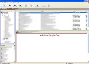
Unfortunately, email browsers (or traditionally Mail User Agents – MUA) are even more tricky and diverse than web browsers where some are entirely cloud-based (e.g. Yahoo! mail), some are application-based (e.g. Microsoft Outlook) and some are a hybrid of the two (e.g. Zimbra). In addition, email browsers do not allow the embedding of Javascript code [for security reasons] and CSS3 support is not consistently supported either so we are not able to adopt either of these technologies in the programming of responsive email templates.
So how can we achieve responsiveness on email templates?
Back in 2000 before CSS was very popular the position of elements on webpages were controlled entirely by the creative use of tables within tables [or nested tables]. For the programming of email templates, we have not really moved away from this model. Even to this day, email templates are using nested tables and not CSS. Because Media Queries are a CSS3 directive, they cannot be used in email templates. Therefore, we have to find other ways to make an email template responsive.
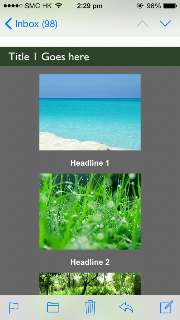
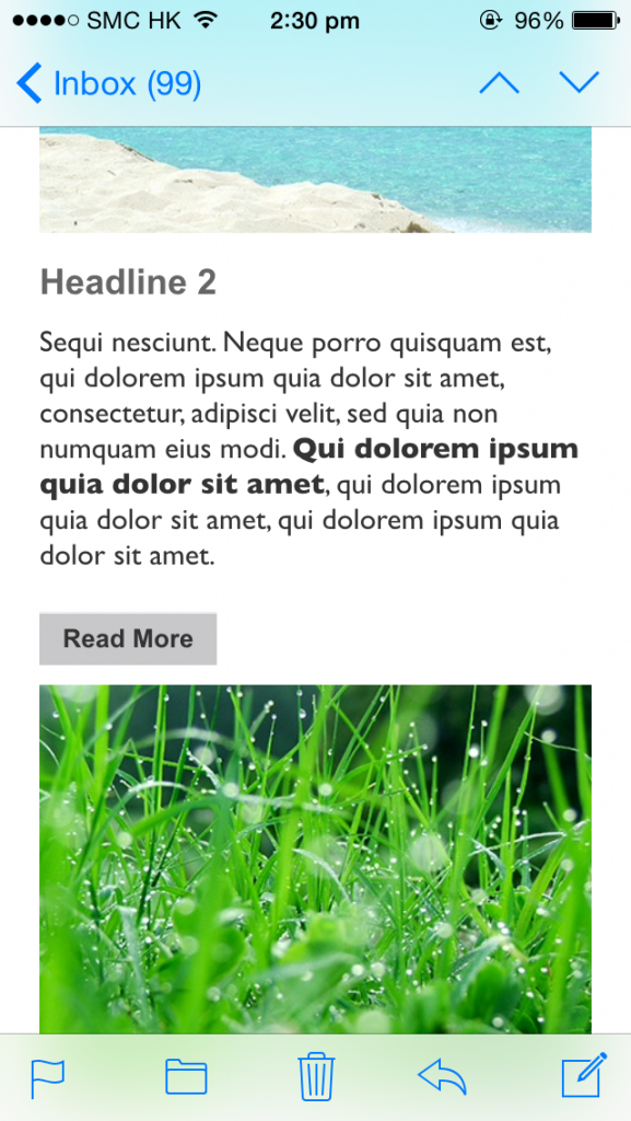
Creative developers got around the issue using tables and inline CSS directives to give the illusion of responsiveness?
The following is an example of using HTML code to make 2 columns in an email reflow to display one after the other in a singe column. Please do not get put off if you can’t understand the code below.
You can see that the by using the directive “max-width” and nested tables. Therefore, we are able to achieve (in a very crude way) responsive display whereby one table is reflowed below the other. However, there are many limitations with the method in the way that it is much harder. If not impossible, to control the order of the reflow and the triggers for reflow.
So in answer to the original question of the difference between responsive website templates and responsive email templates. We can now see that the underlying technologies are about as far apart as they get even though both technologies appear to be doing the same thing. In fact, there are virtually no similarities at all in the programming code for website templates and email templates. Therefore, at least for the next 5 years we will have to continue to develop separate responsive templates for websites and emails.
As a developer, I really hope that life will become simpler and email browsers will converge more. Therefore, we will be able to write a single template that will work on all web browsers and all email browsers; until then developers will continue to have to write separate templates for the web and for emails and test each template across a myriad browsers.
Example of Responsive Email Code:-
<!– Start 2 Columns –>
<table align=”center” style=”width: 100%;max-width: 620px;”>
<tr>
<td style=”padding: 0;text-align: center;font-size: 0;”>
<!–[if (gte mso 9)|(IE)]>
<table width=”100%” cellspacing=”10″>
<tr>
<td width=”50%” valign=”top”>
<![endif]–>
<div class=”column” style=”width: 100%;max-width: 300px;display: inline-block;vertical-align: top;”>
<table style=”border-spacing: 0;width: 100%;font-size: 16px;text-align: left;”>
<tr>
<td align=”left”> Column 1 Text
</td>
</tr>
</table>
</div>
<!–[if (gte mso 9)|(IE)]>
</td><td width=”50%” valign=”top”>
<![endif]–>
<div style=”width: 100%;max-width: 300px;display: inline-block;vertical-align: top;”>
<table style=”border-spacing: 0;width: 100%;font-size: 16px;text-align: left;”>
<tr>
<td align=”left”>
Column 2 Text
</td>
</tr>
</table>
</div>
<!–[if (gte mso 9)|(IE)]>
</td>
</tr>
</table>
<![endif]–>
</td>
</tr>
</table>
</li>
<!– End 2 Columns –>

